
Introducing Midnight Summer
Soft. Smokey. Deep…..
If you are new to colour analysis, here’s the basic idea: different people are flattered by different families of colour, depending on qualities such as temperature (how warm or cool a colour is), depth (how light or dark it is) and chroma (how bright, clear or muted it is). Traditional seasonal colour analysis groups these colour families into four broad seasons — Spring, Summer, Autumn and Winter — with further sub-seasons sitting within them.
Midnight Summer is my answer to a particular gap within that traditional framework.
It has the depth typically associated with Winter, but also possesses the soft, gentle chroma associated with Summer.Midnight Summer has the depth typically associated with Winter, but also possesses the soft, gentle chroma associated with Summer.
Are you unsure whether you truly belong to Winter or Summer? Do you crave softness in your colours — but find that the traditional Summer palettes (like those from Sci/Art or similar systems) feel too light, too insubstantial, or just fail to support your natural colouring? Have you crowdsourced opinions only to receive conflicting feedback — with the one consistent message being “you’re definitely cool-toned”?
🔑 Midnight Summer may be the key you’ve been searching for.
It’s giving moody but soft. Gentle but deep. Cool, but smokey rather than clear….

In Poeticize Your Presence, I recognise that many people exist in the subtle spaces between categories. It’s common to be a hybrid — you might blend elements of Midnight Summer and Bluebell Summer, for example. Or you might even sit at the edge between Midnight Summer and a Winter sub-season.
What defines Midnight Summer?
Temperature: Cool-neutral — leaning far closer to cool than to true neutral.
Chroma: Medium to low chroma — the colours are soft, smoky, and muted, never loud or jarring.
Depth: Medium to deep — deeper than most Summer types, but never as stark or heavy as Winter.
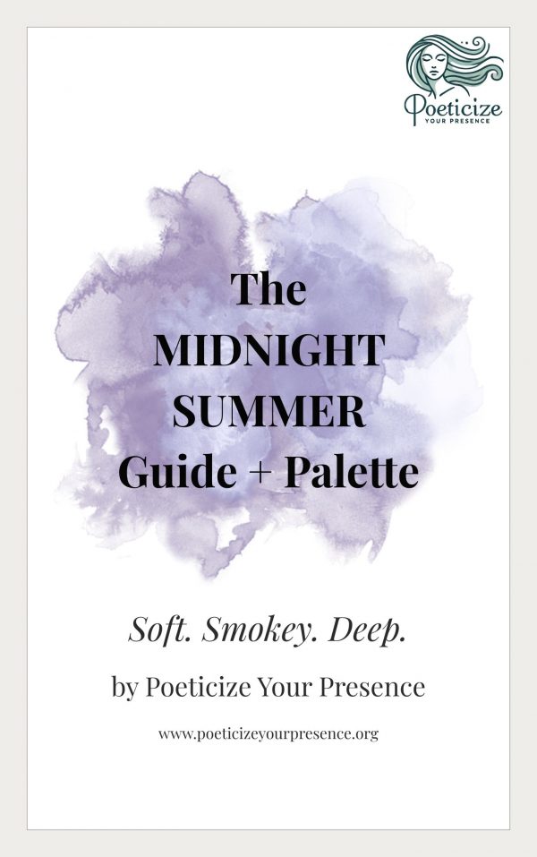
Midnight Summer Colour Palette & Ebook
LEARN HOW TO ROCK YOUR MIDNIGHT SUMMER COLOURS!
Midnight Summer palette and guide. This beautifully designed ebook is your definitive guide to the Midnight Summer colour type — created for those who need softness and depth in their colours, with cool-neutral tones that flatter and enhance natural harmony.
**Available for pre-order at a special price of $9.99. Full price is $14.99 from October 17th.**
🎨 Your Best Colours
Stormy navy
Dusky plum
Charcoal grey
Smoky lavender
Silvery cedar
Blue-based dusty rose
Soft twilight teal
These colours have depth and atmosphere, softened as though seen through evening light. They enhance your natural colouring without overwhelming it.
And this is only a glimpse of the complete Midnight Summer palette.
🚫 Colours to avoid
Optic white — too stark
Warm, golden browns or camel — clash with your cool depth
Bright corals or warm tomato reds — too warm, too high chroma
Icy pastels – too harsh, too ghostly
Why Midnight Summer matters
Midnight Summer makes room for something traditional Summer palettes can sometimes miss — depth without overwhelming intensity. This is a comes alive in shadowed, smoky colour but can be overwhelmed by Winter’s clarity and starkness.
Midnight Summer is storm clouds and dusky roses; charcoal, twilight teal and softened plum. It is coolness with atmosphere. Gentleness with presence. A Summer palette with dusk in it.
And because colour rarely fits perfectly into a single box, you may be purely Midnight Summer — or you may discover intriguing affinities with neighbouring Poeticize Your Presence seasons. That’s part of the story, too.